CREATING NEW BRANDS
From large to small, creative to construction,
software to hardware… every project presents
an opportunity for businesses to grow
and reach their full potential.

PACO & LUCIA
Paco & Lucia was in need of a logo and visual identity for their brand. Their dog apparel targets a high end market, and combines classic styles with delicate details of Peruvian textile designs. They wanted their brand to be elegant, while alluding to the Peruvian culture in a subtle way. They liked the versatility of using the dogs and the logotype independently for apparel, tags, trade booth graphics, etc. The bright colors of the alpaca wool threads used in Peruvian fashion became the smaller dog’s shape and the highlight of the design, as well as the background texture for other marketing materials.
The conceptual PROCESS began with the logotype
From slick to classic and contemporary, the initial concepts were crucial for finding the right balance. The chosen design, which is featured below center, swapped one breed for a Pug and incorporated a high resolution close-up of the alpaca wool threads notorious in high-end Peruvian designs.

TARDIO PLUMBING
The most difficult client is yourself…and your husband!
Tardio Plumbing is a tri-state commercial/residential plumbing company that handles contracts large and small, from private to commercial to public works. This is a lot of ground to cover visually. The bold clean graphic compliments Tardio Plumbings versatility. Established and experienced, yet friendly and approachable. In the end, we were both pleased with the solution.

SUSTAINITURE
sustainable furniture that rescues trees
The combination of a tree top with the base of a furniture piece (as a trunk) represents the resurrection of unwanted furniture pieces into functional art. Their creations save the lives of trees and space in land fills. Buy something they’ve found and retrofitted, or give new life to Aunt Bessie’s sideboard. Everyone will be better for it and mother earth will thank you. Soft and sophisticated, the identity speaks to quality and creativity. A texture generated from the logo art provides a great background or textile for packaging and tissue paper.

FEHR: RE-BRAND
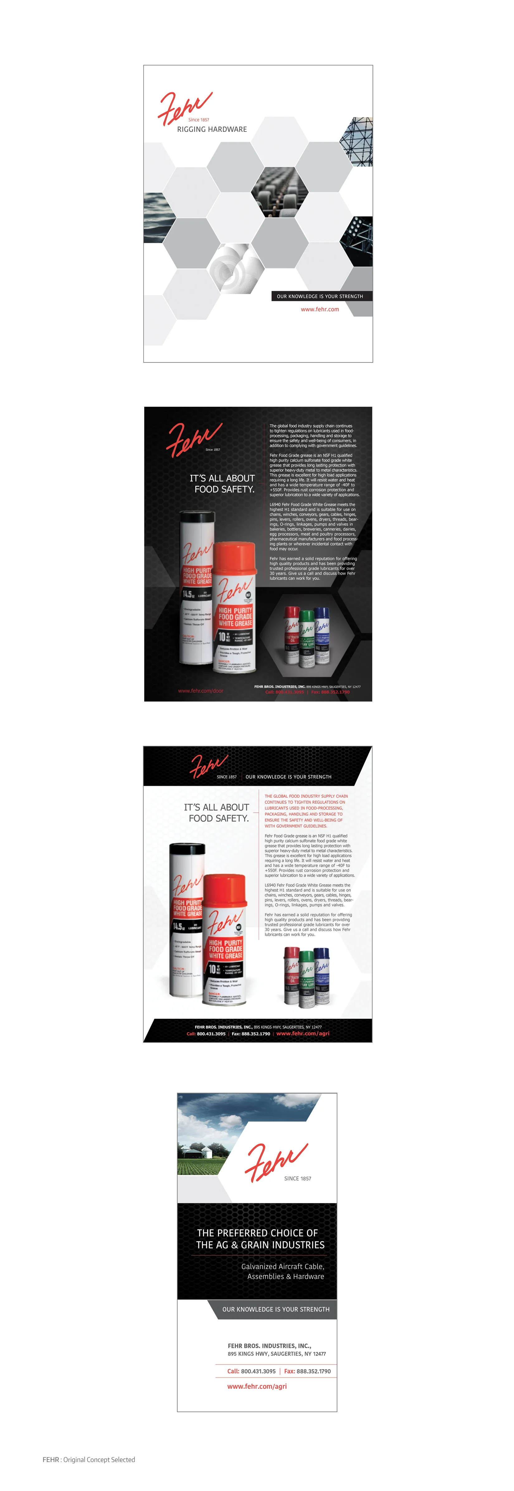
Fehr had an existing logo, but needed to create a consistent corporate brand that would be applied to multiple industry divisions and product lines. Additionally, each division had individual needs which needed to be satisfied without breaking away from the new umbrella brand. Once the brand was devised, the visual system was applied across all marketing channels.

WHERE’s TINO
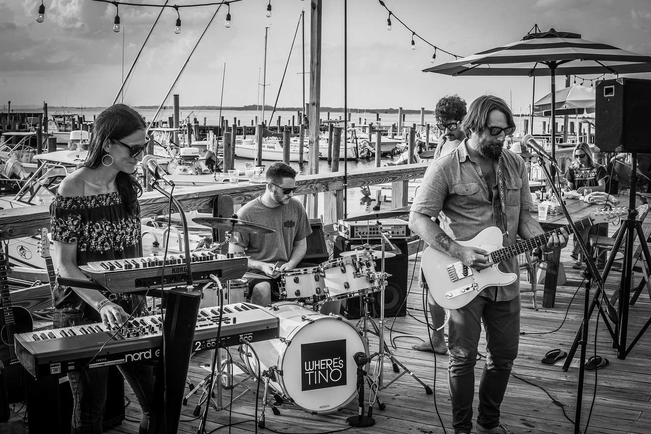
LOCAL JERSEY SHORE BAND, “WHERE’S TINO”
In order to distribute their first album and start promoting themselves, the band needed a logo + packaging + t-shirts + stickers, etc. Under lead singer Mike Boylan’s art direction, photographer Andrew Wolff captured images that encapsulated the band’s creative collaboration and helped expedite the design and production of their promotional materials.
SOZO ART+ NATURE
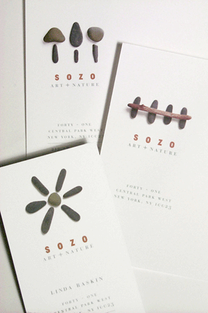
This client was beginning her career as a landscape designer. Her company was nameless and her look yet to be determined. She wanted to position her work as a fusion of Japanese and English Country style. The name generated was “Sozo”, which is Japanese for “the art of creation”. The visual system is a series of stone formations representing the balance of artistic style with the beauty of nature. The tagline became “art + nature” tying it all together. From name generation to a cohesive identity, this design was acknowledged in Print Magazine’s Regional Design Annual and by American Corporate Identity.

hissyfix
Hissyfix is a device that eliminates the hissing sound created when generating audio electronically. The logotype style and color are visually fitting for the industry and the bug is meant to visually signify an erratic sound smoothed-out via the handheld device. A simple splash page delivers the necessary particulars in a practical format.

INTERNATIONAL DAY OF PEACE CONCERT
The United Nations unanimously proclaimed the International Day of Peace to be observed each year on September the 21st, worldwide. As part of the design team, below are some of the concepts I generated for an IDOP concert logo.

HUDSON COFFEE Co.
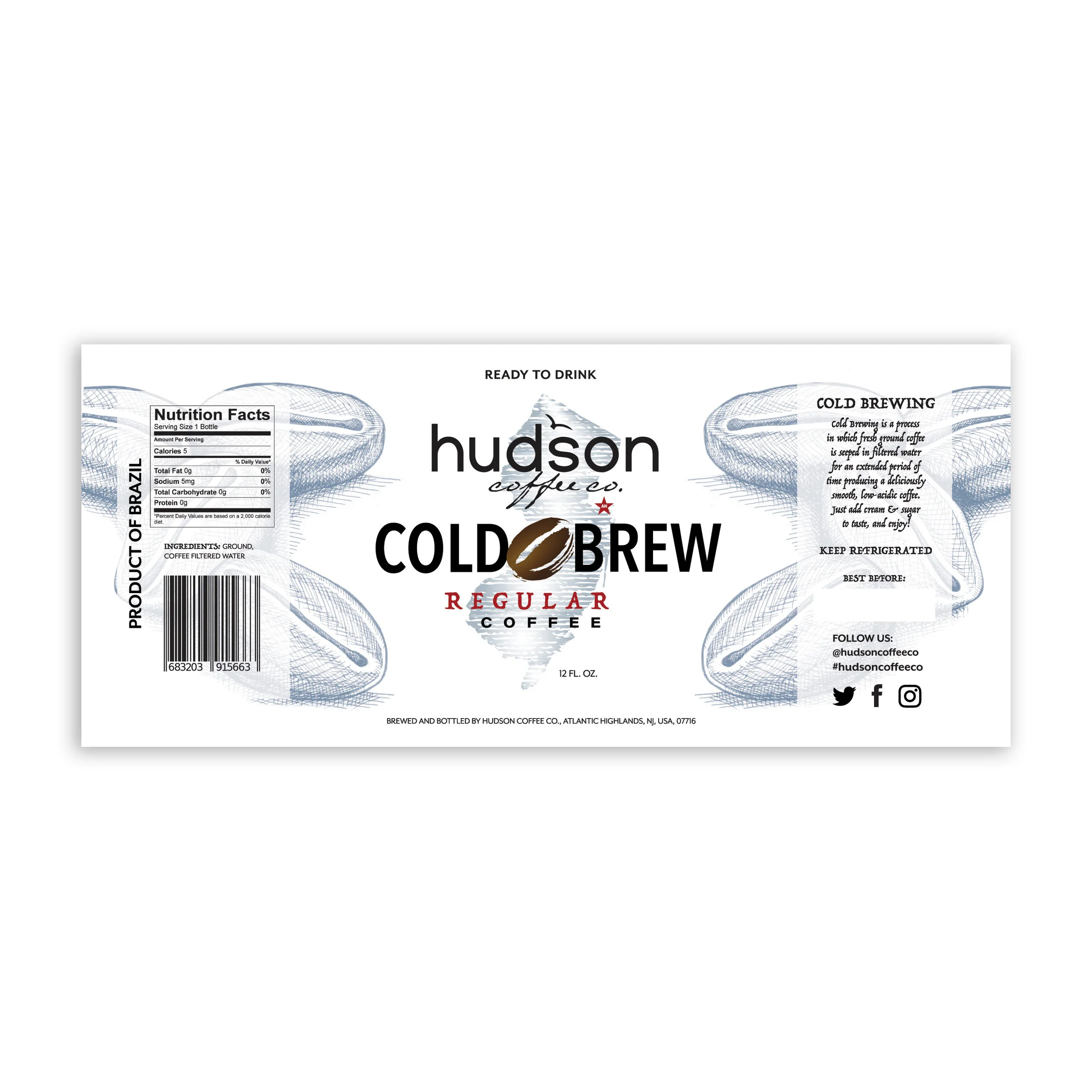
A local coffee roaster launched an ice coffee brand for distribution in grocery chains from New Jersey to New York City. The labels featured a rework of their original cafe logo along with illustrations which were used to color code and distinguish each individual flavor.

bodyology bootcamp
The Bodyology Bootcamp combined bootcamp/recruit style training through several types of excercise methods with oversight by a chiropractor that specialized in nutrition. The logo was designed to reflect the combination of the different aspects of the program.


